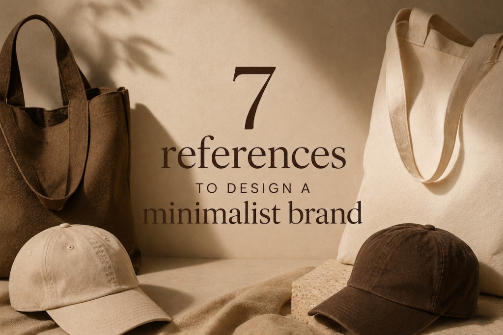
Minimalism has a branding problem.
Somewhere along the way, it got flattened into a formula: neutral colors, oversized blanks, tiny logos, and just enough whitespace to feel “intentional.” The result? A market flooded with brands that look calm, but feel forgettable.
If you’re building a clothing brand for a premium US audience, that approach won’t cut it anymore. Your customer has already seen it and worn it and scrolled past it.
Real minimalism isn’t about reducing things until they disappear. It’s about removing the unnecessary so that what remains feels inevitable. It carries weight. It holds attention without asking for it.
This blog isn’t here to give you surface-level inspiration. These are seven deeper references, rooted in nature, philosophy, and overlooked visual patterns, that can help you design a minimalist brand that actually feels premium, distinct, and emotionally sharp.
1. Wabi-Sabi — The Power of Imperfect Permanence
Most minimalist brands chase perfection. Crisp lines. symmetry. controlled execution. That’s exactly why they feel lifeless.
Wabi-sabi takes the opposite stance. It finds beauty in imperfection, wear, and subtle irregularities, not as a flaw, but as proof of existence.
What this means for your brand:
- Choose garment-dyed or washed blanks that carry natural variation
- Lean into slightly faded tones instead of flat, untouched color
- Use embroidery that feels soft and integrated, not overly sharp
These aren’t “defects.” They’re identity markers. Premium minimalism doesn’t always look new; it looks like it belongs to the wearer.
Why this works: There’s a growing fatigue around overly polished, mass-produced clothing. Pieces that feel too perfect often feel too replaceable. When something carries subtle irregularity, it signals rarity, even if it’s produced at scale.
2. Negative Space (Ma) — Designing What You Don’t Show
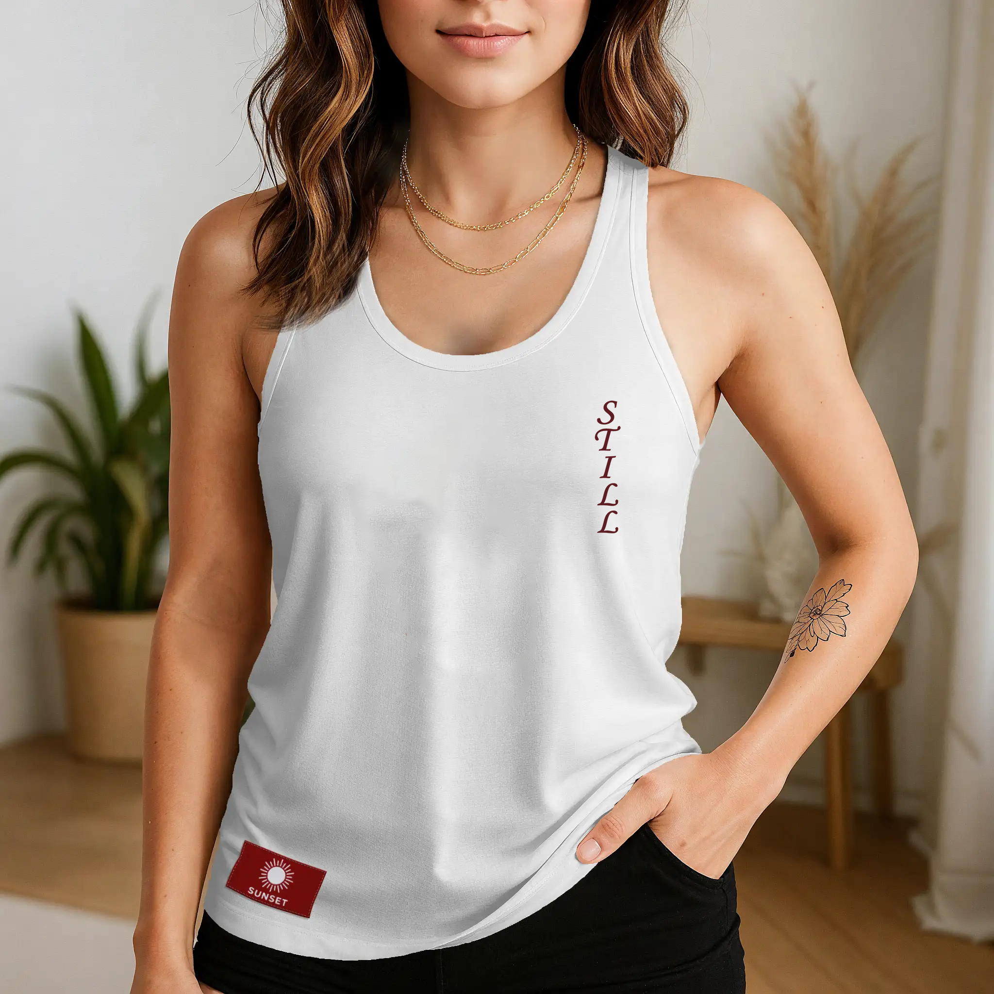
Minimalism isn’t about having less. It’s about knowing what to leave out. The concept of “Ma” refers to the space between elements, the pause that gives everything else meaning. Most brands misunderstand this. They remove elements but don’t replace them with intention. The result feels empty instead of controlled.
What this means for your brand:
- Strategic blank areas in graphics – not accidental emptiness
- Logos placed where they feel like a pause, not a stamp
- Enough breathing room for the garment itself to be part of the design
Think of it like music. Silence isn’t absence, it’s structure.
Application idea: Instead of placing branding front and center, shift it:
- Slightly off-axis
- Near seams
- Hidden in folds
This creates discovery. And discovery creates attachment.
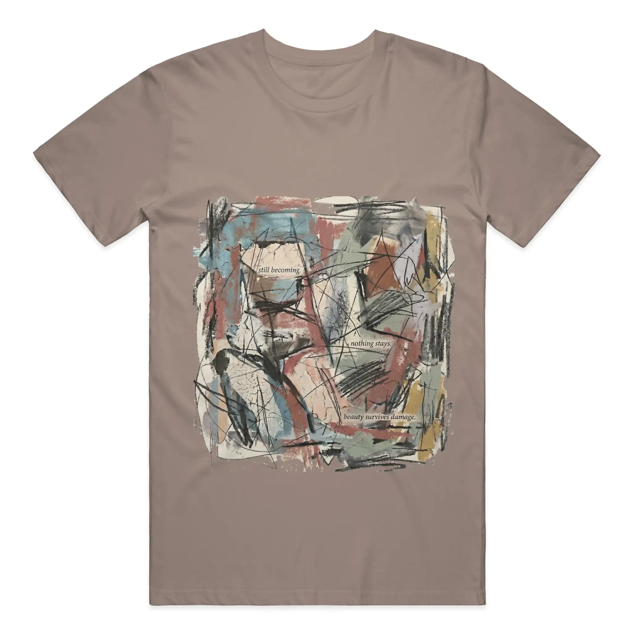
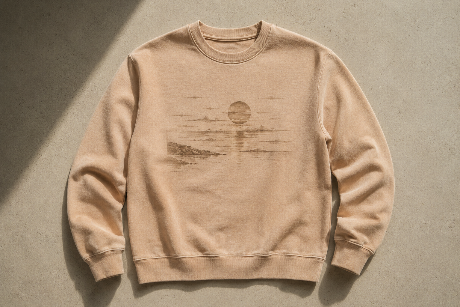
3. Shadow Gradients — Minimalism That Reveals Itself
As a reminder, the best print quality is achieved with artworks at 100% opacity. You can still use shadows and gradients so long as they do not transition to transparency. Make sure you transition between colors so that a white underbase can be applied to all parts of your artwork. Or if you want to fade to transparency, make sure you’re printing with digital print on a white color garment to avoid the white underbase. Kindly note that all transfer prints have a white artwork. Artwork preparation is key to success with this type of graphic!
Look at a wall during sunset. It’s not one color, it’s a quiet transition of tones that shift as light changes. This is where most minimalist brands miss an opportunity. They rely on flat color when they could be working with depth.
What this means for your brand:
- Tonal / 3D embroidery (black on black, cream on off-white)
- Subtle gradients that don’t feel overly graphic
- Layering tones instead of relying on contrast
This is minimalism that doesn’t announce itself. It reveals itself.
Why it matters: Premium customers aren’t impressed by what’s obvious. They’re drawn to what unfolds slowly.
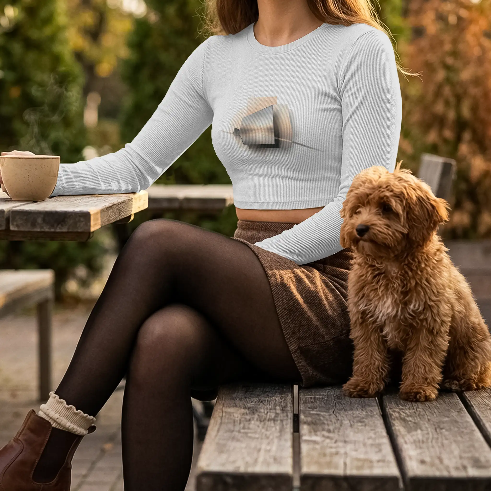
4. Kintsugi — Highlighting the Structure, Not Hiding It
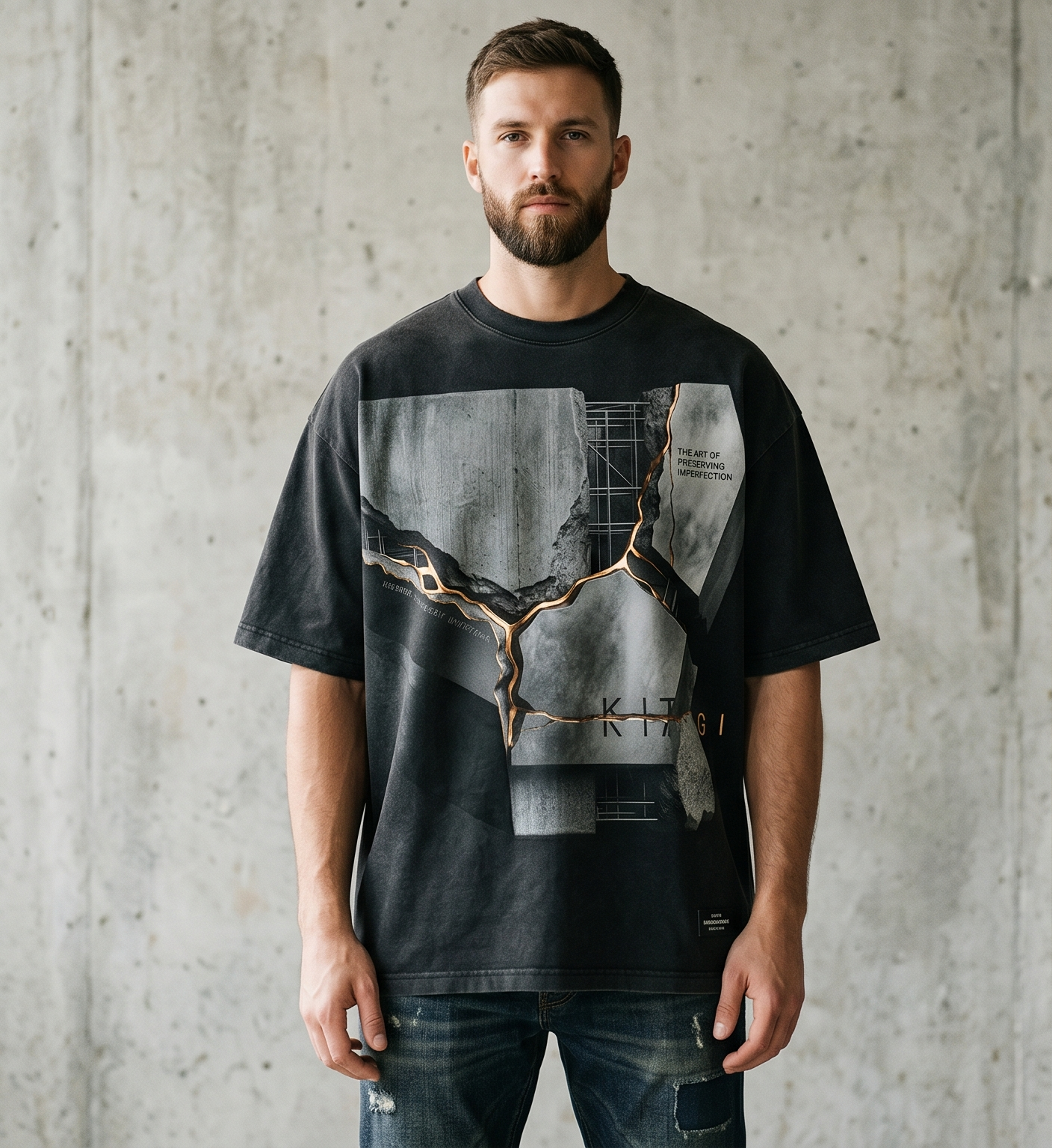
Kintsugi is the art of repairing broken pottery using visible gold seams. Instead of hiding damage, it transforms it into the focal point. In clothing, this doesn’t have to mean altering construction. It’s about visual direction.
What this means for your brand:
- Use graphics, embroidery, or prints that guide the eye naturally across the garment
- Work with natural garment areas like sleeves, hems, backs, and center placements intentionally
- Keep the visual language controlled, even when using larger artwork
Most brands try to hide construction. Premium minimalism reveals it.
Application idea: Use placement-led detailing instead of construction-led detailing:
- Create a strong focal graphic, but keep the surrounding garment visually quiet
- Use tonal artwork, limited palettes, or soft contrast so the print feels integrated instead of overpowering
- Repeat visual themes, symbols, or textures across your collection to create a recognizable identity system
5. Natural Weathering — Let Time Be Part of the Design
Rain patterns, sun fading, and repeated wear create subtle changes that make a piece feel personal.
That’s exactly why they’re valuable.
What this means for your brand:
- Choose finishes and techniques that look better over time
- Select pigment-dyed garments and vintage washes
- Avoid overly bold prints that lose character with wear
- Focus on elements that remain relevant after repeated use
6. Liminal Space — The Aesthetic of “Almost Nothing.”
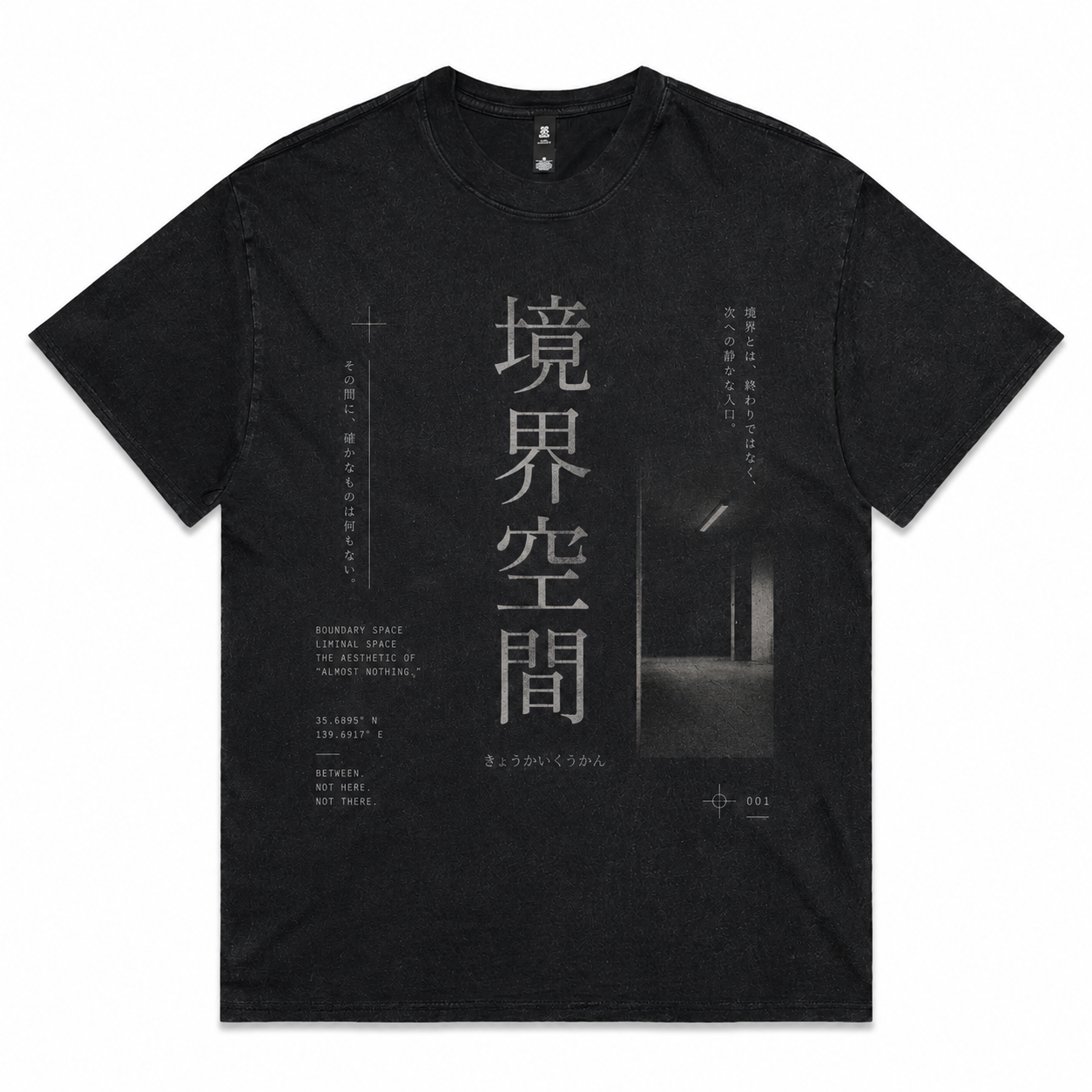
Liminal spaces are those in-between moments: empty hallways, quiet parking lots at night, places that feel like transition rather than completion. Something is unsettling and compelling about them.
What this means for your brand:
- Keep designs minimal but slightly off from the expected
- Use placement and scale to create subtle tension
- Let the garment feel familiar, but not predictable
This creates memorability without needing excess. The piece should feel familiar at first glance, but slightly off in a way that makes people look twice.
7. Branding as Design — Where Labels & Patches Become Everything
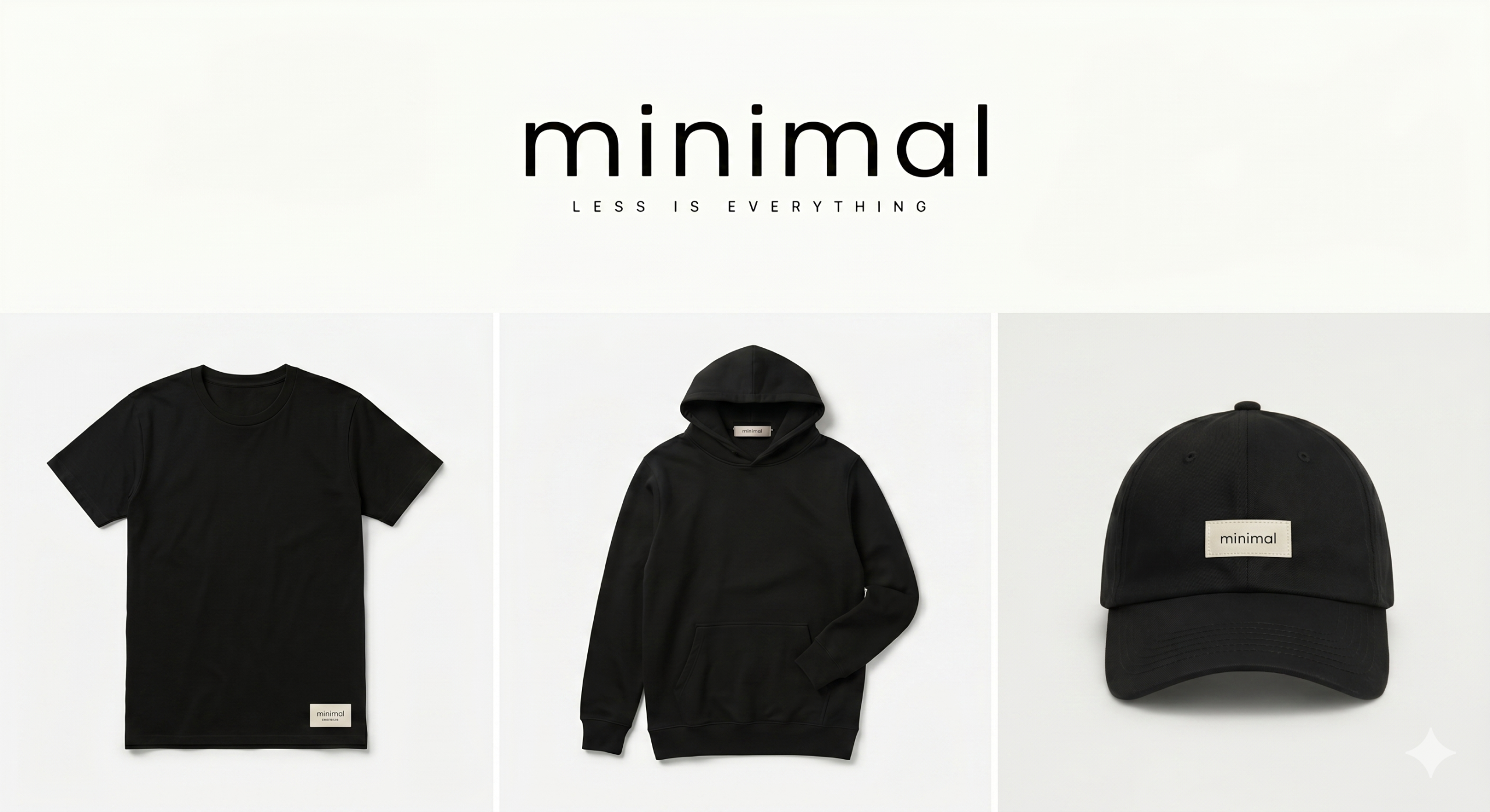
Here’s where most minimalist brands fail: branding.
They either:
- Go invisible (no identity), or
- Overcorrect (loud logos that break the minimal feel)
There’s a third path, and it’s where premium brands win. Your branding doesn’t need to be loud. It needs to be placed. This is where elements like:
- Woven labels
- Minimal patches
- Subtle internal tags
become the strongest part of your design system. Not as an afterthought, but as the core identity.
What this means for your brand:
- A label that feels like part of the garment, not attached to it
- A patch that replaces the need for large graphics
- Branding that’s discovered, not announced
In premium minimalism, your label is your logo placement strategy.
The Shift You Need to Make
If you take one thing from this, let it be this: Minimalism is not about reducing design. It’s about compressing meaning into fewer elements. Most brands remove things and end up with nothing. The brands that stand out remove things and achieve clarity.
How This Comes Together
When you apply these ideas within a POD framework, your brand starts to shift:
- You choose blanks with a character instead of generic ones
- You use placement as a design language
- You build identity through labels and patches, not loud prints
- You design for longevity, not just launch day
Now your products don’t feel like “customized blanks.” They feel like a cohesive brand system.
Final Thought
The market doesn’t need another minimal brand. It needs a brand that understands that minimalism isn’t visual – it’s philosophical. If your clothing can communicate something without saying much, you’ve already won. Not because it’s simple. But because it’s undeniable.